The CUPRA brand, a performance offshoot of SEAT, has, since its inception, been distinguished by a striking logo that reflects both the dynamism and the innovative spirit of the brand. We are disrupting those classical codes in the automotive world, creating a feeling of belonging to a family. To truly understand the significance of the CUPRA emblem, it is essential to delve into the brand's origins and its unique philosophy.
The Genesis of CUPRA: From Performance Line to Independent Identity
CUPRA is a brand of cars and roadsters, though a series of bicycles also appeared in 2003 and again in 2018. Owned by SEAT, the company was created in 1996, but it was only officially introduced as an independent brand in 2018. The name "Cupra" is actually a combination of two words: "Cup" and "Racing." Originally, the name was chosen for a specific trim line in the SEAT Sport series, which was popular enough to justify the introduction of an autonomous brand. Today, CUPRA is synonymous with luxury road cars, having received numerous awards in championships that elevated its reputation to what it is now.
CUPRA describes itself as an "unconventional challenger brand," thanks to its focus on combining stimulating style with contemporary technology. This commitment to innovation is deeply embedded in its core values and is visually represented in its evolving brand identity.
The Evolution of the CUPRA Logo
The CUPRA logo has undergone three significant evolutions, each marking a stage in the brand's journey. Despite CUPRA introducing its first car model in 1996, it did not have a dedicated logo for the brand itself until later.
Early Days: SEAT Sport Influence (Pre-2012)
The First Dedicated Emblem (2012)
The Distinctive CUPRA Emblem (2018 - Present)
In its nascent stages, when CUPRA Racing was still known as "SEAT Sport," the identity was closely tied to its parent company. The CUPRA logo at that time was essentially the SEAT logo, presented in red, complemented by the word "Sport" in black. This early corporate logo, typical for a motorsport brand, often incorporated a checkered flag element, symbolizing its racing heritage and association with the racing landscape.
The year 2012 marked a significant change for the CUPRA logo, as SEAT introduced the first emblem specifically for its road vehicles carrying the CUPRA name. This new logo was presented as a distinct emblem, often described as a flag or trapezium shape. It incorporated the colours white, black, and red, and visually connected to the checkered flag element of its predecessor, signalling a clear step towards a unique identity while maintaining links to its racing roots.
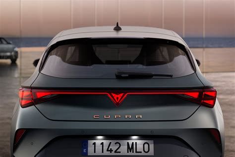
The official presentation of CUPRA as a standalone brand in 2018 brought with it a completely redeveloped and highly distinctive logo. This emblem is central to CUPRA's visual identity, consisting of sharp lines and geometric forms. The design focus is on a graphic image, composed of what can be imagined as two intersecting triangles. The shape of a triangle is very dynamic, and this design aims to give it more speed and make it more dynamic. This sharp, X-shaped emblem features pronounced lines at the top and bottom, with an elongated tail at the bottom and pointed angles at the top. Visually, it is a strong and masculine symbol, imbuing the brand with an energetic and impactful image. The primary colour of the logo, for both the graphic and the text, is black, conveying a sense of sophistication and power.
Below is a summary of the CUPRA logo evolution:
| Year / Period | Description | Key Features |
|---|---|---|
| Pre-2012 | Integrated into SEAT Sport branding | SEAT logo (red), "Sport" text (black), often with checkered flag motif. |
| 2012 | First dedicated CUPRA logo for road vehicles | Trapezium/flag emblem, colours of white, black, and red. |
| 2018 - Present | Current distinct CUPRA emblem | Two intersecting triangles, sharp X-shape, pointed angles, typically black. |
The Philosophy Behind the Emblem: Refinement and Sensation
The CUPRA emblem is more than just a mark; it embodies a promise, a commitment to quality and innovation. It represents a brand that is not afraid to break new ground and constantly redefine the boundaries of what is possible. As a concept, pure performance is a bit old-fashioned; it's not all about the last split-second of speed. When you look beyond that, you will find a new element in CUPRA cars. We're looking for something that is more refined, not brutal or in-your-face, but more elegant and chic.
Speed is definitely one component of CUPRA. Speed is the idea of moving very fast, of sharpening your senses, your sight, and the adrenaline that keeps you awake. The sensation of speed itself is magic. It's inside all of us; speed is cool. However, the important thing for CUPRA is the journey. It's not just about speed on its own or simply getting there by squeezing out the last millisecond of a lap on the Nürburgring - which we've already done!
A Sensory Experience and Design Principles
How different is driving in a CUPRA compared to anything else just going fast? It's about so much more than just driving at high speed. It's the sound, the materials inside the car, and even the smell. In a performance car, everything appeals to the senses. First, there is the visual appeal, so we are focusing on the look of the car. But just as important is agility.
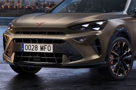
CUPRA aims to create a driver-oriented environment, but not in a puritanical racing kind of way. We use materials that are nice to the touch - we like the human touch. Some elements are made of carbon fibre, but it's more than just sticking some carbon fibre parts on the car. It's all part of the aim to make it perform perfectly, to use beautiful materials and fabrics but to make it simple. That's how we came up with using a copper colour, a very warm, real colour. We want to convey this feeling of warmth that the brand has. CUPRA cars are sporty; they have character, but they are not going to bite you. There's a rather thin line between making something that is characterful and something that is aggressive.
Engineering and Innovation: The Pursuit of Excellence
CUPRA's commitment to innovation is evident in its engineering processes. For instance, the e-Racer has been developed from scratch as a fully electric car - and a very competitive one. The target we had was to be just as fast as an internal combustion engine. Concerning the design, there is a nice story about the first Cup Racer: We put it together very quickly, and it became a big success. However, we didn't have time to develop the aerodynamics, for instance, because it was sort of a secret project. For the Evolution version, we focused on one goal: "Let's make the car 8 km/h faster, without touching the engine, just using aerodynamics. And the car has to look even better." And we did it. When we started talking about the e-Racer, it was another big challenge because our target wasn't easy at all.
Aerodynamics and weight have become very important. The engineers addressed the weight issue and tried to get the best power-to-weight ratio as possible. But the aerodynamics were left to us, the designers. We made it, because you have to have a very clear idea about the philosophy. You have to understand the philosophy of what you're about to achieve. This passion is what drives the team.
The workforce is hand-selected; employees have to feel the brand and be people that take a certain level of risk. They might have to push like hell to get their ideas through. They are people who say: "I get this, but what about if we did it like that?" The people that will be working in production have to be very skilled. A certain number of parts will be made and mounted by hand. We have a great attention to detail, but also this passion to make things with your hands.